Example 1 - Allure

Allure magazine is very clearly one that is targeted at young women (possibly from age fourteen to twenty-five) within the socio-economic band of C1 to D - there is however a chance that it may be attractive to people within other socio-economic grouping.
The most immediate method in discerning the gender and age its targeted at is the masthead. A bright and bold pink written in a lowercase, and unusual, font. Pink, this shade in particular, is a stereotypically "girly" colour; through the use of this alone, you can easily identify the gender that this magazine is targeting. However, you can also use the masthead to identify the age and socio-economic grouping through the font used. The font is unusual and fun implying that it is aimed at a younger audience, most likely within the fourteen to twenty-five band, and is not particularly sophisticated. This rules out the A band at the very least. The masthead has also been written in lowercase; again there is a level of refinement missing that you would associate with the upper two socio-economic classes. Ergo, from the masthead alone you can determine the gender, age and socio-economic grouping.
Another way to determine the audience of this magazine is through the cover lines. "Best HAIR Ever!" and "STRESSED-OUT Skin" are to name a few and all point to a specific gender and age. To begin with, "Best HAIR Ever" suggests that this magazine is for women who do, generally, spend a lot of time in trying to make themselves look nice, their hair included. Not only does this hint towards the gender, but also suggests that it is targeted at an age that places a lot of focus upon making themselves look 'the best': so you can infer that it is targeted at under thirty (thirty is an age that women typically begin to 'lose' their looks and figures). Given the presentation of the masthead and this main cover line, it is same to assume that the highest target age for this magazine is mid-twenties - you can discover the lower limit from the next line: "STRESSED-OUT Skin Superfast Ways to Calm Zits and Redness". As 'stressed-out skin' is something that teenagers experience as they progress through puberty, we can determine that the lower limit is within this time period, most likely fourteen, possibly younger. From two cover lines, you can accurately identify the upper and lower limits of the target audience's age.
A final point to make regarding this magazine cover is the main image: a close up of a young woman. I personally do not know who this is but, from one of the cover lines, I can infer that this is Ashley Greene - the cover line also informs us that she starred in one of the Twilight films. Again, due to how Twilight is teen orientated fiction, you can assume that the target audience is within that boundary and possibly a little above. One of the most notable things regarding the main image is that she is looking directly at the camera; this invites the audience in and encourages them to engage with the magazine and the story. However, the cover line that introduces her gives her whole name; this could be as she is a rising actress and not as well known as others.
Example 2 - Time

Whilst Time magazine does not appear to target any specific gender, it does target then A and B socio-economic classes and probably those in their early thirties and above. Compared to the first example, this magazine is rather simple in its design; its cover is not plastered in cover lines, and the font styles are not excessive in an attempt to seem fun and 'down-with-the-crowd' as the first seemed to be.
Much like how the masthead of Allure magazine is indicative of the audience's age, socio-economic class and gender, so too is the masthead for Time magazine. With a font reminiscent of times new roman, the masthead is very simple and yet appears to carry a level of elegance that the first example lacked; from this it is easy to determine that this magazine is targeting an older and more sophisticated class of people, meaning people within their early to mid thirties who are a part of the socio-economic class of A and B. The gender is harder to discern however; this is because their is no obvious indicator of a specific gender - the colour red, for example, is one that has no immediate association with either gender. As a result, it is safe to assume that the magazine is not gender specific.
Another reason for deciding that the socio-economic classes are A and B is the magazine's content. We can see what the main articles are through the cover lines, the main one creating a heavy focus upon the American presidency. When you consider that the other important articles are concerning nuclear rogues and "Clint's take on heroes", Time magazine presents itself as a very political product. Politics are stereotypically followed by those who are within the top socio-economic classes, immediately meaning that it is targeted at those top bands rather than lower down. As Allure - a highly unpolitical magazine - targets classes lower than Time magazine's audience, this stereotype is given more credit.
The distribution of the cover is also very 'classy'; there are no unnecessary cover lines promoting tips to clearing you skin or nonsensical articles about movie stars. Instead, there is a simple close up of the leader of the democratic party against a plain white background - the main cover line is side by side with the main image, indicative that this is the main article within the magazine. The other cover lines, while visible, are placed in an out of the way area, preventing the cover from becoming overly cluttered.
Film Poster Analysis
Example 1 -
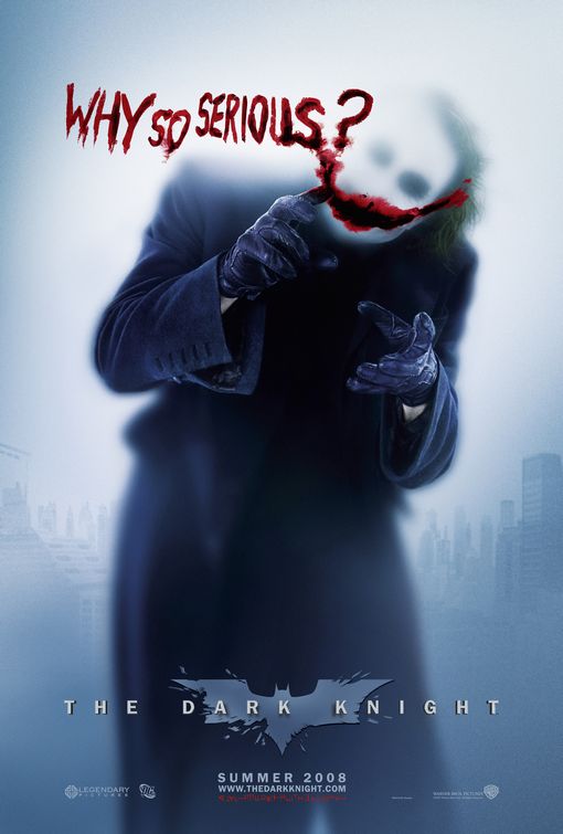
The Dark Knight, released in 2008, is part of the latest Batman series directed by Christopher Nolan, focusing upon the confrontations between the Joker (Heath Ledger) and Batman (Christian Bale). As within any superhero film - as indicated by The Batman's symbol backing the masthead - it is targeted at the male gender; it follows the stereotypes that women like romance and men like action. The film features a male protagonist and antagonist, meaning that women would be less likely to take the preferred reading, and instead opt for the negotiated reading of this text; that is, they would have to place themselves in the 'shoes' of a male protagonist.
As the genre of this informs us that the target audience is male, so too does it inform us of the age and socio-economic class. Given that it is a superhero film, The Dark Knight contains a large amount of violence - this is echoed in the poster: the Joker has written "why so serious?" in what appears to be blood with his hands. The blood is symbolic of the violence and death that the Joker perpetrates throughout the film, immediately establishing him as the Batman's antagonist. Not only that, but it is he writes it with his hands, not any other implement; this is indicative that he is the cause behind most of the violence within the film. As a result of the vast amount of violence, you can assume that the target audience is mid-teens (thirteen to fifteen) and upwards. Also, due to its genre, you can infer that the upper limit for the target would be about thirty.
Another point of note concerning the "why so serious?" is that it is the Joker's catchphrase; it could be said that this is to create a link between the antagonist's name and its meaning: jester, one who makes jokes. The Joker finds his actions to be humourous and is unaware of the gravity of what he does - he is someone who is not in a sane state of mind, and, because of that, he is able to commit great acts of barbarity.
The socio-economic class is harder to discerne; there is little to indicate the most likely band; due to that, you can assume that its quite wide spread. It is unlikely to be targeted at E as it contains the elderly and unemployed, i.e. those who cannot afford or are uninterested in this film, and, although students are a part of this grouping, they are the minority within the group and, as such, abnormalities in the statistics. Also, professional people are unlikely to view this whilst in the cinema, meaning that the most likely socio-economic grouping is from B to D.
In this image the glass on which the Joker is writing is frosted, obscuring himself and the skyline of Gotham city, whilst the smile he has drawn in blood is approximately over his perpetual smile. This makes me thinks of the quote "there's daggers in men's smiles" (Macbeth, W.S.) one that means that the smile is just a facade worn by a dangerous person, an apt description for the Joker then. It is also refers to the changeable story the Joker tells about how he received the scars that make up his mutilated smile'; whilst we never know the reasoning behind it, we do know that it must have been, not only painful, but bloody too. The final thing that this bloody smile could be symbolic of, is the Joker's mentality; he finds humour in pain and death.
The fact that the glass obscures the Joker's face is also notable; it conceals his identity much like his clown make up does. Throughout the film, the Joker's real identity is never established unlike the Batman, whom the audience knows is Bruce Wayne by day. As a result, the Joker is only ever known as the Joker, a character no doubt created by the man, but has eventually evolved until all there is of the person, is the Joker. Again, this is indicative of the character's madness; he is the Joker, and the Joker is insane. His gloved hands are another manner of concealing his 'real' identity, meaning that the only way he can ever be known is by his pseudonym.
The distribution of this poster is also meaningful: while Gotham, a large city, is situated in the background at the bottom of the poster, the Joker is in the centre and appears to tower over the city. A possible interpretation is that the Joker dominants the city during his time there - another could be indicative of the Joker's character: he is larger than life. This links back to the idea of the Joker's real identity and the character he portrays.
Example 2 - The Conjuring

The Conjuring is a supernatural horror film that is supposedly based of real events; this alone limits the target audience. It is unlikely to be directed at any specific gender as both men and women enjoy watching films of the same genre, however its target will probably be fifteen to thirty-five, possibly higher.
An extreme longshot of a large house smothered in fog and completely isolated is the image that the audience is confronted with; all of these characteristics are part of the horror genre. The fog promotes a ghostly feel, and, coupled with the isolated location, you get a sense of entrapment that films like these like to create within the viewers. A dead tree within the foreground inspires foreboding within the audience, and given the noose and the shadow on the ground, you can infer that this text will tell of the ghostly occupants and occurances within the house.
We know from the text that this is based on a true story and is also from the director of Saw and Insidious, two highly popular horror films. This will extend the clientele that the film is targeted for, meaning that the socio-economic class will probably be fairly wide - most likely C1 to D, though it has a possibility of extending into the upper and lower groupings depending upon the individuals.
No comments:
Post a Comment